|
What I did…
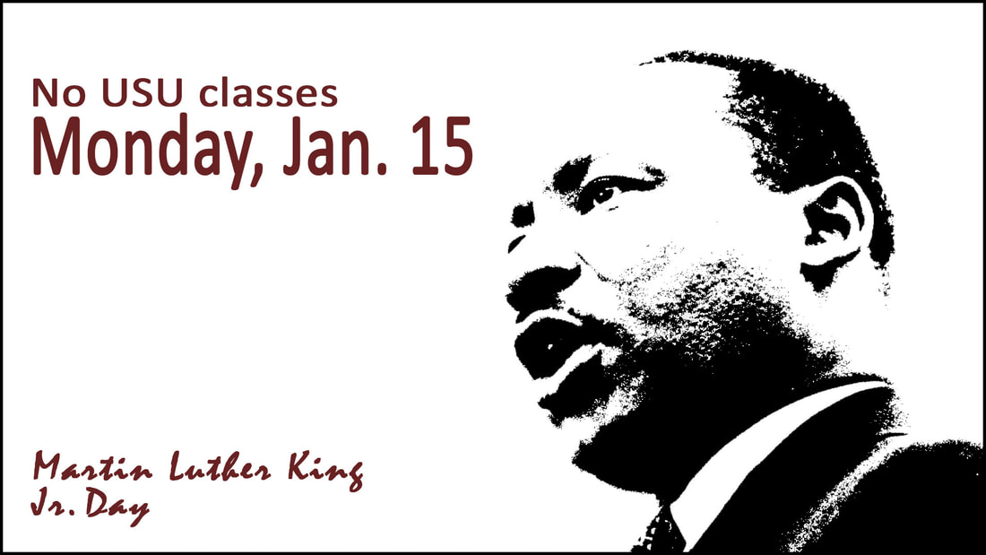
I decided to create a display announcing that there will be no class for Martin Luther King Jr. Day. I made the date, Monday, Jan. 15 the center of attention. I did this by placing the type in red and enlarging the font. I also stretched the font vertically so I could enlarge it even further without making it run into the image. The words “no class” are in the same sans-serif font (Calibri), left-aligned, and in the same color red. This repetition shows that the two pieces of information go together, while also contrasting with type size to direct attention to the most important information. The viewer’s eyes are then directed to the next attention-getting element: the image. I used a photo of Martin Luther King Jr. I got rid of some distracting elements, then edited the image with a threshold adjustment layer, gradient adjustment layer, and contrast adjustment layer to create the look I wanted. I also flipped the image horizontally because it looked better that way with the text. Finally, at the bottom of the display I wrote the words “Martin Luther King Jr. Day” in Kunstler script. I picked a font that was light, and did not direct too much attention to itself. The script font is in red, which is the same as the font above, yet because it is a script font, it also contrasts with the sans-serif font. The viewer will likely imply that there is no school that day because of MLK day without the bottom text, but the text serves to reinforce that idea. Photoshop skills/tools used: move tool, crop tool, eye dropper tool, clone stamp tool, bucket tool, text tool, layers, and adjustment layers. Photo credit: https://s-i.huffpost.com/gen/2049830/images/o-MARTIN-LUTHER-KING-VIETNAM-facebook.jpg. |
