|
What I did…
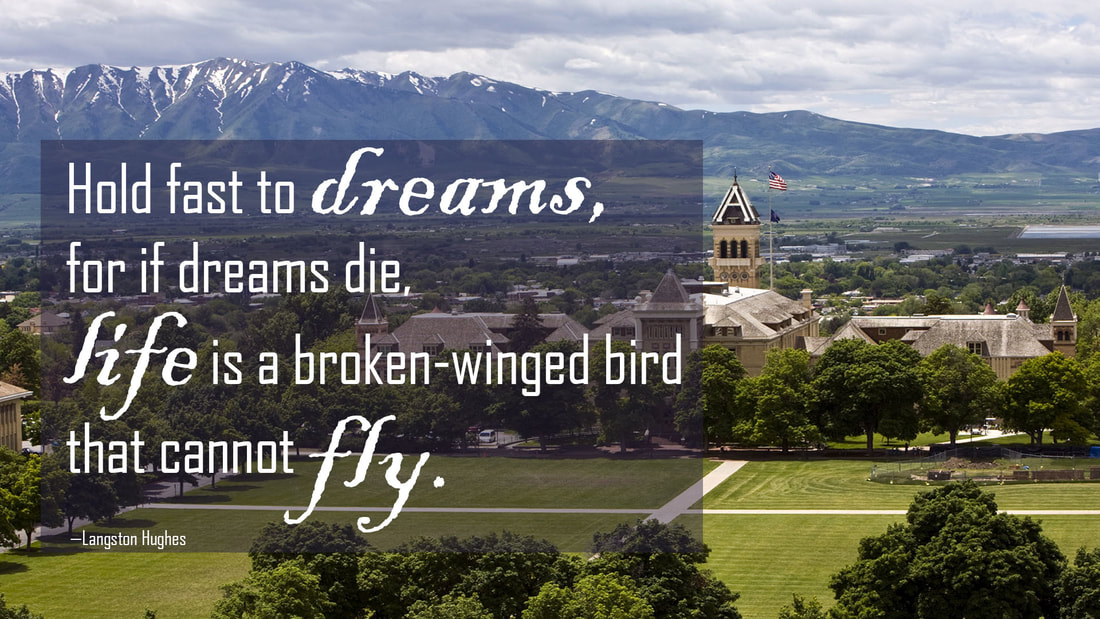
I used contrast to draw attention to various words within the quotation. Because this is a motivational poster, I wanted to draw attention to the positive words. This was a little tricky because the quote serves more as a warning than as motivation, and as such the quote is rather depressing. However, by contrasting the different fonts and emphasizing the words “dreams,” “life,” and “fly,” I am able to turn the warning into something more motivating. The lines of text from the quote are near each other so the viewer knows they belong together. I used Agency FB 115 point font for the main body of text. It is a sans-serif font which works well with the serif type used on the “A”. I used Agency FB at 34 point font for Langston Hughes. His name was not important for the overall design, which is why it is much smaller than the rest of the text. However, if anyone wants to know who said the quote, they can still find that information. I used Blackadder ITC 220 point font for the words “dreams,” “life,” and “fly.” This is a script font which pairs nicely with the sans-serif. The structure also contrasts nicely with the sans-serif because it mimics an oldstyle font with letter thickness that varies. It is also a thicker font than the sans-serif. The words are in a bigger font to create additional contrast. The text is aligned to the left. This creates a strong line down the left of the poster which guides the viewer’s eyes down the text. The “A” is aligned at an important intersection of a nine-square grid which draws the eyes there as well. Photo credit: http://catalog.usu.edu/mime/media/12/3184/Old%20Main,%20quad.JPG |
