|
What I did…
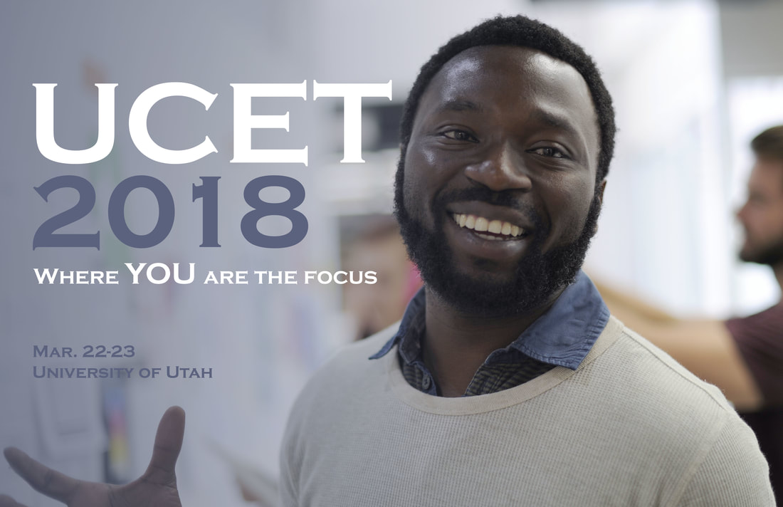
I used the principle of contrast to emphasize the two most important elements—UCET and this year’s theme (you). They are represented in white to make it jump off the page and contrast with the other elements. I repeated the blue color from the man’s shirt throughout the design, both in fading out the image as well as in the text to tie everything together. I used a strong left alignment throughout the whole design, and I took special note to group related elements together. The main focus of the message is grouped together, and then I left some space before placing some additional info (date and place). I used Copperplate Gothic Bold for the font. Photo credit: https://pixabay.com/en/african-descent-business-cheerful-2477763/ |
