
|
|
|
|
What I did…
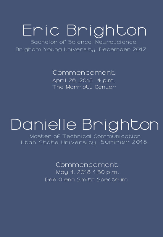
I focused on contrast to make a statement about the information I included on the back of the graduation announcement. I used a large (33 pt.), bold Ormont font in white for the names to make them easy to read. I then used a light blue Ormont font (11 pt.) for the degree information. I used a different color to make the two contrast. For additional contrast I returned to the white color for the information about commencement exercises. For the front of the announcement I used Mistral, a script font that contrasts nicely with the sans serif Ormont for the rest of the card. I set it at a slant to convey excitement and energy about our upcoming graduations. I also took care to adjust the kearning between the letters in the names. I made a pixelated image of the photo to select colors that would match well throughout the design. In addition to color, I repeated the font type (Ormont) on the back. These two repetitive elements serve to make the announcement cohesive. I paid special attention to this principle as I decided where to put all of the information. I wanted people to be able to quickly scan the back to find the information they are looking for. With this in mind, I grouped the corresponding information (information about degree, commencement exercises) close to each person’s name. I additionally put space between the degree information and commencement exercise schedules to show that while they’re related, they’re also different types of information. The information is aligned down the center for a clean, slightly formal look. |
