|
|
What I did…
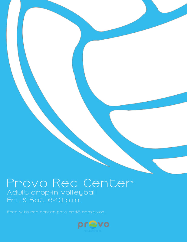
I wanted the flyer to be simple, yet draw attention. To do so, I placed a large, bold image of a volleyball so that it takes up most of the page. I designed the volleyball so that its lines and the background are one and the same. This makes the image and poster seem like one element rather than two separate ones. To create some visual interest, I placed the volleyball so that it runs off the page. However, there’s enough of it on the page for it to be easily recognized as a volleyball. Before the reader even reads what the flyer is about, they instantly know the flyer will talk about volleyball, or sports at the very least. The eyes are then drawn to the information telling the viewer about the rec center’s adult drop-in volleyball days and times. I used Ormont, a light, casual, sans-serif font. It’s a font with a lot of open space, and it mimics the open space of the volleyball. The heavy white of the volleyball contrasts with the airy white of the font. The information is aligned in the bottom left-hand corner, and the city logo is center-aligned below that. Credit: Provo logo: http://elevennews.byu.edu/wp-content/uploads/2016/11/provo-pic.png Volleyball: https://thetomatos.com/wp-content/uploads/2017/06/excellent-volleyball-vector-balls-image.jpg |
